html

10 little-known HTML tags that nobody uses

There’s way more to HTML than <div>, <a>, and <p>.

So much more sophisticated and powerful tags that you’ve probably never used.

From modern list visualization to 🎨 colorful highlights, let’s look at 10 little-known but capable HTML tags.

1. The <abbr> tag

The <abbr> tag defines an abbreviation or acronym, like HTML, CSS, and JS.

And LOL too – though that’s more of a standalone word these days.

I'm reading about
<abbr title="Hypertext Markup Language">HTML</abbr>
tags at
<abbr title="Coding Beauty">CB</abbr>
The abbreviation is indicated with a dotted line by default.
Dotted line for abbreviation.

We use the title attribute of the <abbr> tag to show the description of the abbreviation/acronym when you hover over the element:

Hover over <abbr> to show the full form:
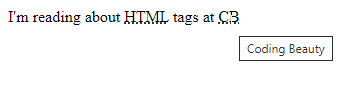
Hovering over the <abbr> element.

2. The <q> tag

The <q> tag indicates that the text inside of it is a short inline quotation.

<q>Coding creates informative tutorials on Web Development technologies</q>

Modern browsers typically implement this tag by wrapping the enclosed text in quotation marks:

The text in the <q> tag is wrapped with quotation marks.

3. The <s> tag

<s> strikes through.

To correct without destroying the change history.

Buy for <s>$200</s> $100
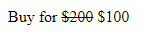
Indicating price change with the <s> tag.

The <del> and <ins> pair are similar but semantically meant for document updates instead of corrections.

<!DOCTYPE html>
<html lang="en">
  <head>
    <style>
      del {
        background-color: lightsalmon;
      }

      ins {
        text-decoration: none;
        background-color: lightgreen;
      }
    </style>
  </head>
  <body>
    My favorite programming language is <del>JavaScript</del>
    <ins>TypeScript</ins>
  </body>
</html>

Indicating editorial changes in a document with the <del> and <ins> tags.

4. The <mark> tag

Marks or highlights text.

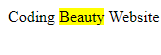
Coding <mark>Beauty</mark> Website

Yellow background color by default:

The <mark> tag applies a bright yellow background to its enclosed text.

Like how browsers show search results.
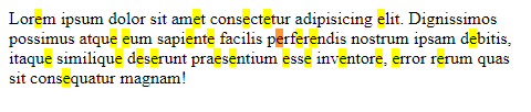
Display search results for the letter "e" with the <mark> tag.
e e e e e e ….

5. The <wbr> tag

<wbr> tells browser, “You can only break text here and there”

So the browser doesn’t get lousy and start break crucial words all over the place.

That’s why it’s wbr — Word BReak Opportunity

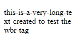
<p>this-is-a-very-long-text-created-to-test-the-wbr-tag</p>
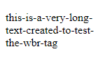
The text is broken at a location chosen by the browser.
Browser is joking around.

But now with <wbr />

<p>this-is-a-very-long-te<wbr />xt-created-to-test-the-wbr-tag</p>

Broken precisely after ...-te:

The text is broken at the location set with the <wbr> tag.
Obviously no reason to break there in real-world code though.

6. The <details> tag

<details> is all about expanding and contracting — like the universe.

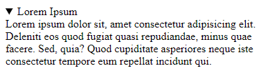
<details>
  <summary>Lorem Ipsum</summary>
  Lorem ipsum dolor sit, amet consectetur adipisicing elit. Deleniti eos
  quod fugiat quasi repudiandae, minus quae facere. Sed, quia? Quod
  cupiditate asperiores neque iste consectetur tempore eum repellat incidunt
  qui.
</details>

Contract:

A closed disclosure widget.
The disclosure widget is closed (default state).

Expand:

An open disclosure widget.
The disclosure widget is open.

7. The <optgroup> tag

The name says it all — grouping options.

You can usually group gigantic option lists into clear hierarchies, and <outgroup> is here to help.

<select name="country" id="countries">
  <optgroup label="North America">
    <option value="us">United States</option>
    <option value="ca">Canada</option>
  </optgroup>
  <optgroup label="Europe">
    <option value="uk">United Kingdom</option>
    <option value="fr">France</option>
  </optgroup>
</select>

Countries → continents.
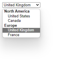
An open dropdown list contains grouped options.

8. The <datalist> tag

<datalist> is all about making inputting text effortless.

With dropdown lists for autocomplete:

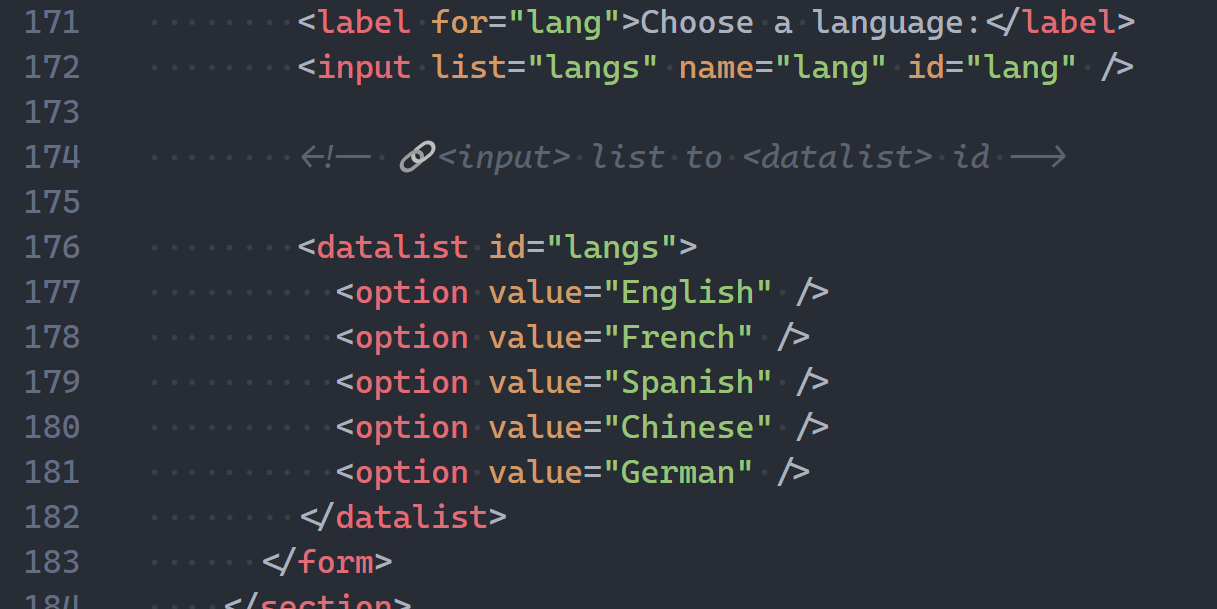
<form>
  <label for="lang">Choose a language:</label>
  <input list="langs" name="lang" id="lang" />

  <!-- 🔗<input> list to <datalist> id -->

  <datalist id="langs">
    <option value="English" />
    <option value="French" />
    <option value="Spanish" />
    <option value="Chinese" />
    <option value="German" />
  </datalist>
</form>
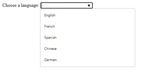
An input with an available list of options.
A list of available options for the input is displayed in a dropdown list.
An input with a responsive list of options.
The available options change according to what the user types in the input.

9. The <fieldset> tag

A set of fields — farmers must find it useful.

Creating a clean visual separation to easily understand the forms.

<form>
  <fieldset>
    <legend>Name</legend>

    <label for="fname">First Name:</label>
    <input type="text" id="fname" name="fname" /><br />
    <label for="mname">Middle Name:</label>
    <input type="text" id="mname" name="mname" /><br />
    <label for="lname">Last Name:</label>
    <input type="text" id="lname" name="lname" />
  </fieldset>
  <br />
  <label for="email">Email:</label>
  <input type="email" id="email" name="email" />
  <br /><br />
  <label for="password">Password:</label>
  <input type="password" id="password" name="password" />
</form>

We use the <legend> tag to define a caption for the <fieldset> element.
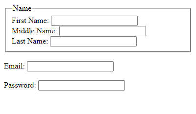
Input elements, some grouped with a <fieldset> tag.

10. The <sup> and <sub> tags

<sup> — superscript.

<sub> — subscript.

<p>This text contains <sub>subscript</sub> text</p>
<p>This text contains <sup>superscript</sup> text</p>
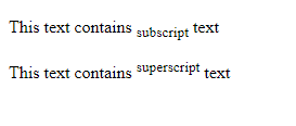
The text contains both subscript and superscript.

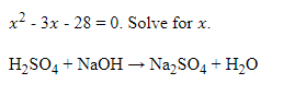
Something more intense: neutralization reaction 🧪

&#x1D465;<sup>2</sup> - 3&#x1D465; - 28 = 0. Solve for &#x1D465;. <br />
<br />
H<sub>2</sub>SO<sub>4</sub> + NaOH &#8594; Na<sub>2</sub>SO<sub>4</sub> +
H<sub>2</sub>O
Conclusion

In this article, we explored some of the least known and utilized tags in HTML. These rare tags can be quite useful in particular situations despite their low usage.
How to Create the Material Design Text Field With HTML, CSS, and JavaScript

Material Design is a popular UI design system developed by Google. Apps using Material Design typically include responsive animations, attractive color combinations, and depth effects such as lighting and shadows.

In this article, we’ll learn how to recreate the design and animation of the Material Design text field, using only HTML, CSS, and JavaScript. We’ll be cloning the outlined text field variant, but similar steps can be taken to create the filled variant.

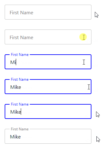
Here’s what we’ll have when we’re done:

The completed Material Design text field.

Create basic input and label

We’ll get started by creating the basic structure of the text field with HTML.

HTML

<div class="input-container">
  <input
    type="text"
    id="fname"
    name="fname"
    value=""
    aria-labelledby="label-fname"
  />
  <label class="label" for="fname" id="label-fname">
    <div class="text">First Name</div>
  </label>
</div>

We create an input element to allow typing into the text field, and we use a label element as the label for the text field. The text for this label (First Name) is wrapped in a div (.text) for because of the text animation we’re going to do later.

We use another div (.input-container) to wrap both the input and label elements, so that later we’ll able to place the label on top of the input with absolute positioning.

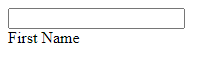
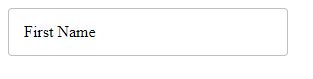
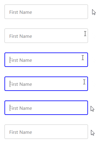
The basic input and label
The basic input and label.

Style input and label

Let’s add some styles for the input element and its container.

CSS

.input-container {
  position: relative;
}

input {
  height: 48px;
  width: 280px;
  border: 1px solid #c0c0c0;
  border-radius: 4px;
  box-sizing: border-box;
  padding: 16px;
}

We set position: relative for the container so that the label will be positioned relative to it when we set position: absolute for the label, instead of the entire page.

We’ll add styles for the label now.

CSS

.label {
  position: absolute;
  top: 0;
  bottom: 0;
  left: 16px;
  display: flex;
  align-items: center;
}

Apart from the position: absolute we just talked about, we set top: 0 and bottom: 0 to make the label match the height of the input container.

The input has a 16px padding, so we set left: 16px to make the label match this padding and start from the same position as any text the user will type. Lastly, we horizontally center the contents of label in the input container using display: flex and align-items: center.

The input and label have been styled.

Remove pointer events

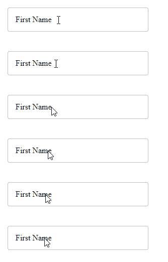
It looks like a text field now, but if you hover over the label, you’ll see the mouse pointer indicating that this is something that can be clicked. This means that it can block clicks on the input, which would create a bad user experience.

The label blocks clicks on the input.

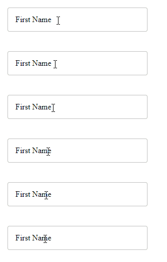
Luckily, we can easily fix this by setting pointer-events: none for the label element.

CSS

.label {
  ...
  pointer-events: none;
}
The label no longer blocks clicks on the input.

Style input font

Let’s change the font family and font size of the input text. We’ll do the same for the label.

CSS

input, .label .text {
  font-family: 'Segoe UI';
  font-size: 16px;
}
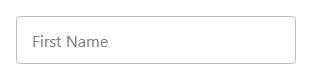
The font of the input and label has been changed.

Style input on focus

Let’s use the :focus CSS selector to change some of the input styles when it receives focus.

CSS

input:focus {
  outline: none;
  border: 2px solid blue;
}

With this, the input border changes color and becomes thicker when the input gains focus.

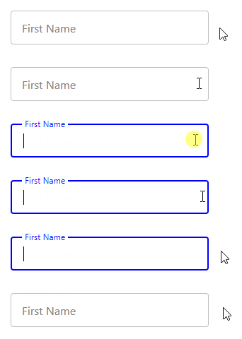
The input border changes color and becomes thicker on input focus.

Style label on input focus

Let’s also style the input label when it is focused. On gaining focus the label should shrink, move up to meet the top input border, and change color to match the input border.

CSS

input:focus + .label .text {
  font-size: 12px;
  transform: translate(0, -50%);
  background-color: white;
  padding-left: 4px;
  padding-right: 4px;
  color: blue;
}

We set padding-left: 4px and padding-right: 4px to add some visual spacing between the label and the top input border.

Styling the label on input focus.

For a smooth transition, we’ll add a transition property to the label.

CSS

.label .text {
  transition: all 0.15s ease-out;
}
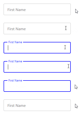
Adding a smooth transition to the label.

Keep label on top when non-empty input loses focus

There’s one more thing we have to do. When you enter text in the input element and remove the input, the label goes back to its original position.

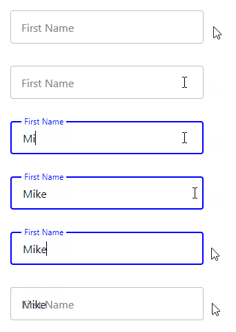
When you enter text in the input element and remove the input, the label goes back to its original position.

It shouldn’t behave in this manner. But now we’re going to fix it with some CSS and JavaScript.

Remember, we’ve already defined a value attribute for the input element. We set it to an empty string.

HTML

<input
  type="text"
  id="fname"
  name="fname"
  value=""
  aria-labelledby="label-fname"
/>

Using the :not pseudo-class, we make the input when focused have the same style as when it is unfocused and non-empty. The only difference will be the color of the input border and label.

CSS

input:focus + .label .text, :not(input[value=""]) + .label .text {
  font-size: 12px;
  transform: translate(0, -150%);
  background-color: white;
  padding-left: 4px;
  padding-right: 4px;
}

input:focus + .label .text {
  color: blue;
}

We’re not done yet. Even though the value DOM property of the input changes according to what is entered, the value HTML attribute stays the same. We need a way to keep it in sync with the value property.

We can do this by adding a listener for the input event, which fires whenever the text in the input field changes. In the listener, we’ll use the setAttribute() method to update the value attribute with the current value of the value property.

JavaScript

const input = document.getElementById('fname');

input.addEventListener('input', () => {
  input.setAttribute('value', input.value);
});
The Material Design text field is complete.

That’s it. We’ve successfully created an outlined Material Design text field.

If you’re using a framework like Vue or React, it should be pretty easy to abstract everything we’ve done into a reusable component.

Here’s the complete source code: