Material Design is a popular UI design system developed by Google. Apps using Material Design typically include responsive animations, attractive color combinations, and depth effects such as lighting and shadows.
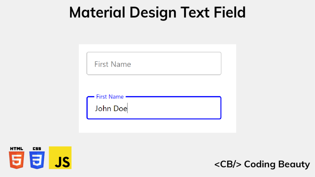
In this article, we’ll learn how to recreate the design and animation of the Material Design text field, using only HTML, CSS, and JavaScript. We’ll be cloning the outlined text field variant, but similar steps can be taken to create the filled variant.
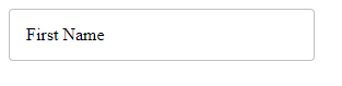
Here’s what we’ll have when we’re done:
Create basic input and label
We’ll get started by creating the basic structure of the text field with HTML.
HTML
<div class="input-container">
  <input
    type="text"
    id="fname"
    name="fname"
    value=""
    aria-labelledby="label-fname"
  />
  <label class="label" for="fname" id="label-fname">
    <div class="text">First Name</div>
  </label>
</div>
We create an input element to allow typing into the text field, and we use a label element as the label for the text field. The text for this label (First Name) is wrapped in a div (.text) for because of the text animation we’re going to do later.
We use another div (.input-container) to wrap both the input and label elements, so that later we’ll able to place the label on top of the input with absolute positioning.
Style input and label
Let’s add some styles for the input element and its container.
CSS
.input-container {
  position: relative;
}

input {
  height: 48px;
  width: 280px;
  border: 1px solid #c0c0c0;
  border-radius: 4px;
  box-sizing: border-box;
  padding: 16px;
}
We set position: relative for the container so that the label will be positioned relative to it when we set position: absolute for the label, instead of the entire page.
We’ll add styles for the label now.
CSS
.label {
  position: absolute;
  top: 0;
  bottom: 0;
  left: 16px;
  display: flex;
  align-items: center;
}
Apart from the position: absolute we just talked about, we set top: 0 and bottom: 0 to make the label match the height of the input container.
The input has a 16px padding, so we set left: 16px to make the label match this padding and start from the same position as any text the user will type. Lastly, we horizontally center the contents of label in the input container using display: flex and align-items: center.
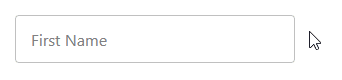
Remove pointer events
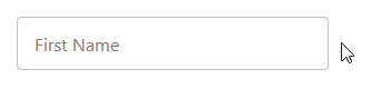
It looks like a text field now, but if you hover over the label, you’ll see the mouse pointer indicating that this is something that can be clicked. This means that it can block clicks on the input, which would create a bad user experience.
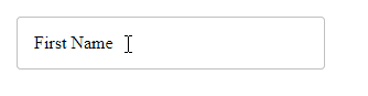
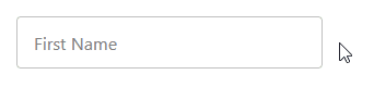
label blocks clicks on the input.Luckily, we can easily fix this by setting pointer-events: none for the label element.
CSS
.label {
  ...
  pointer-events: none;
}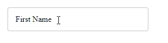
label no longer blocks clicks on the input.Style input font
Let’s change the font family and font size of the input text. We’ll do the same for the label.
CSS
input, .label .text {
  font-family: 'Segoe UI';
  font-size: 16px;
}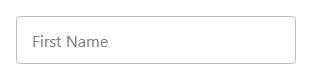
input and label has been changed.Style input on focus
Let’s use the :focus CSS selector to change some of the input styles when it receives focus.
CSS
input:focus {
  outline: none;
  border: 2px solid blue;
}
With this, the input border changes color and becomes thicker when the input gains focus.
Style label on input focus
Let’s also style the input label when it is focused. On gaining focus the label should shrink, move up to meet the top input border, and change color to match the input border.
CSS
input:focus + .label .text {
  font-size: 12px;
  transform: translate(0, -50%);
  background-color: white;
  padding-left: 4px;
  padding-right: 4px;
  color: blue;
}
We set padding-left: 4px and padding-right: 4px to add some visual spacing between the label and the top input border.
For a smooth transition, we’ll add a transition property to the label.
CSS
.label .text {
  transition: all 0.15s ease-out;
}
Keep label on top when non-empty input loses focus
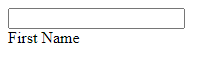
There’s one more thing we have to do. When you enter text in the input element and remove the input, the label goes back to its original position.
It shouldn’t behave in this manner. But now we’re going to fix it with some CSS and JavaScript.
Remember, we’ve already defined a value attribute for the input element. We set it to an empty string.
HTML
<input
  type="text"
  id="fname"
  name="fname"
  value=""
  aria-labelledby="label-fname"
/>
Using the :not pseudo-class, we make the input when focused have the same style as when it is unfocused and non-empty. The only difference will be the color of the input border and label.
CSS
input:focus + .label .text, :not(input[value=""]) + .label .text {
  font-size: 12px;
  transform: translate(0, -150%);
  background-color: white;
  padding-left: 4px;
  padding-right: 4px;
}

input:focus + .label .text {
  color: blue;
}
We’re not done yet. Even though the value DOM property of the input changes according to what is entered, the value HTML attribute stays the same. We need a way to keep it in sync with the value property.
We can do this by adding a listener for the input event, which fires whenever the text in the input field changes. In the listener, we’ll use the setAttribute() method to update the value attribute with the current value of the value property.
JavaScript
const input = document.getElementById('fname');

input.addEventListener('input', () => {
  input.setAttribute('value', input.value);
});
That’s it. We’ve successfully created an outlined Material Design text field.
If you’re using a framework like Vue or React, it should be pretty easy to abstract everything we’ve done into a reusable component.
Here’s the complete source code:
11 Amazing New JavaScript Features in ES13
This guide will bring you up to speed with all the latest features added in ECMAScript 13. These powerful new features will modernize your JavaScript with shorter and more expressive code.